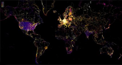
Geovisualisation
Discover how geographers bring a unique perspective to presenting data in innovative and understandable ways.
Find a geovis

AI within a geospatial context
Steve Attewell has created an experimental map control system that uses hand gestures, voice recognition and artificial intelligence.

Mapping museums
Andrea Ballatore and Fiona Candlin used visualisations to better understand the spatial unevenness of the cultural sector across the UK.

Air pollution in Europe
Discover how James Cheshire created this map displaying nitrogen dioxide levels across Europe.

Voting patterns and deprivation in the UK
Learn how Alasdair Rae created this visualisation showing the link between voting patterns and levels of deprivation in the UK after the 2019 general election.

Mapping COVID-19
Andy Murdock describes how Maploom has created a visualisation which displays the evolution of the coronavirus (COVID-19) pandemic.

Great Britain's largest islands
Learn how Paul Naylor and his team at Ordnance Survey created this visualisation showcasing Britain’s largest islands.

Britain's greenest city centres
We spoke to Dr Paul Brindley and Dr Jake Robinson about this visualistion showing Britain's greenest and least green city centres.

Mapping glacial lake outburst flood exposure
We spoke to Caroline Taylor, PhD researcher at Newcastle University, about this visualisation mapping exposure to glacial lake outburst floods.

Priority places for food
We spoke to Peter Baudains about this visualisation displaying priority places for food.

Mapping visual exposure and desirable passive surveillance
We spoke to Collins Terkpetey-Hushie about this visualisation assessing privacy, including why and how it was made.

Visualising avalanches in the Himalayas
Geographers from the University of Aberdeen used earth observation data to understand avalanches in Chamoli district, Uttarakhand.

Flood Guidance Statement
Brian Vinall, Operations Manager at the Flood Forecasting Centre for the Environment Agency, worked with a team to develop the Flood Guidance Statement, which provides Category 1 and 2 responders with information to help them with emergency planning for flood events.
Geography has never been more important in helping us to understand our rapidly changing world.
Geographers bring a critical perspective and approach to interpreting and presenting data. They help make new connections between different types of data by interweaving spatial methods with knowledge about our world, and finding innovative and understandable ways to present it.
In this series of images, we look at the power of maps and geographical data visualisations for telling stories about our world. We explore the ways in which connecting data on people, places and environments underpins good decision-making and improves communication and understanding. In the interviews with the creators that accompany each image, we showcase the skills, data, techniques and tools used to tell these stories, and the insight they can bring.
If you would like to suggest an image for the series, or would like to take part, get in touch at policy@rgs.org.